CausalML API: Quick Start
This notebook provides a runnable walkthrough of the CausalNavigator API.
Each section pairs the API documentation with a live code cell so you can
test every method end-to-end.
The CausalML module is a high-level wrapper around the causalml library
designed to simplify causal inference workflows for observational studies. It
includes the CausalNavigator class for heterogeneous treatment effect
estimation, diagnostic methods for assumption validation, and helper
functions for data preprocessing and visualisation.
Architecture
While causalml provides powerful meta-learners (S/T/X-Learners), the
native API requires significant boilerplate for data preprocessing,
assumption checking, and visualisation. CausalNavigator standardises that
workflow into a single class.
The core pipeline has three layers:
- Diagnostic Layer: Verifies causal assumptions (specifically Common Support) before estimation
- Estimation Layer: Wraps
causalml.inference.metaclasses (BaseXRegressor, etc.) and injects XGBoost as the standard base learner - Interpretation Layer: Provides built-in methods to visualise
heterogeneity, abstracting away
matplotlibcomplexity
Setup
%load_ext autoreload
%autoreload 2


import numpy as np
import pandas as pd
import seaborn as sns
import matplotlib.pyplot as plt

import logging
import utils

import warnings
warnings.filterwarnings("ignore")

_LOG = logging.getLogger(__name__)
utils.init_logger(_LOG)
WARNING: Running in Jupyter
INFO > cmd='/opt/venv/lib/python3.12/site-packages/ipykernel_launcher.py -f /root/.local/share/jupyter/runtime/kernel-a17e709d-653a-4e17-8cac-c16690a9ba10.json'
/opt/venv/lib/python3.12/site-packages/tqdm/auto.py:21: TqdmWarning: IProgress not found. Please update jupyter and ipywidgets. See https://ipywidgets.readthedocs.io/en/stable/user_install.html
  from .autonotebook import tqdm as notebook_tqdm
import os

# TODO(gp): Use import X.
from utils import (
    CausalNavigator,
    download_cdc_data_if_needed,
    load_cdc_data,
    preprocess_for_causal,
)
Load data set.
# Download and load the dataset.
filename = "diabetes_binary_health_indicators_BRFSS2015.csv"
data_path = os.path.join("data", "unprocessed", filename)
download_cdc_data_if_needed(data_path)
df_raw = load_cdc_data(data_path)
Dataset already present at: data/unprocessed/diabetes_binary_health_indicators_BRFSS2015.csv
Loading data from: data/unprocessed/diabetes_binary_health_indicators_BRFSS2015.csv
Dropped 24206 duplicate rows
df_raw.head(3)# TODO(ai_gp): Add a short explanation of the data above, e.g., what are features, what are target vars.Prepare data set
Function: preprocess_for_causal(df, ...)
- Purpose: Splits the dataframe into components for causal analysis:
- X (Covariates) - features used to control for confounding
- T (Treatment) - the binary intervention vector
- Y (Outcome) - the target variable
# Prepare data for causal analysis.
treatment_col = "PhysActivity"
outcome_col = "Diabetes_binary"
covariate_cols = [
    "HighBP",
    "HighChol",
    "Age",
    "Income",
    "Sex",
    "GenHlth",
    "BMI",
]


df_clean, X, T, Y = preprocess_for_causal(
    df_raw,
    treatment_col=treatment_col,
    outcome_col=outcome_col,
    covariate_cols=covariate_cols,
)
Prepare Demo Data
Set seed for reproducibility and subsample for speed.
Parameters:
learner_type: Meta-learner to use:'S','T', or'X'control_name: Label for the untreated group (used in plots)treatment_name: Label for the treated group (used in plots)
# Set seed for reproducibility and subsample for speed.
np.random.seed(42)
sample_indices = np.random.choice(X.index, size=10000, replace=False)
X_demo = X.loc[sample_indices]
T_demo = T.loc[sample_indices]
Y_demo = Y.loc[sample_indices]
print(f"API Demo Data Loaded. Shape: {X_demo.shape}")
print(X_demo.head())

# Initialize the CausalNavigator.
navigator = CausalNavigator(
    learner_type="X", control_name="Sedentary", treatment_name="Active"
)
API Demo Data Loaded. Shape: (10000, 7)
HighBP HighChol Age Income Sex GenHlth BMI
218137 0.0 0.0 10.0 8.0 0.0 2.0 24.0
234092 0.0 0.0 13.0 4.0 0.0 1.0 22.0
220499 0.0 0.0 10.0 4.0 1.0 2.0 25.0
133305 1.0 1.0 10.0 1.0 0.0 5.0 24.0
1394 0.0 1.0 12.0 2.0 0.0 3.0 28.0
check_overlap(X, T)
Purpose: Validates the Positivity/Overlap assumption.
- Inputs: Covariate matrix
X, Treatment vectorT - Output: A density plot of Propensity Scores
- Why use this: If the distributions do not overlap, causal estimation is invalid. This method enforces safety before modelling - the treated and control groups must share common support across the feature space.
# Check if there is "Common Support" between the treated and control groups.
navigator.check_overlap(X_demo, T_demo)
Calculating Propensity Scores for Overlap Check
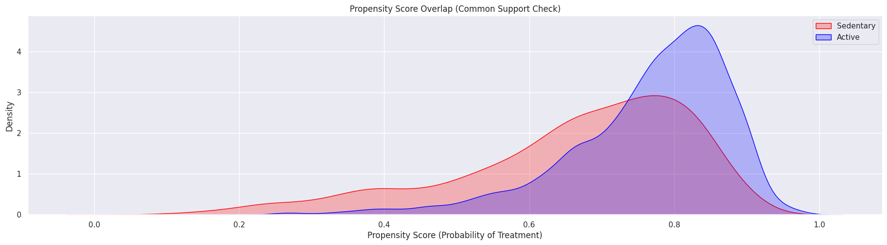
--- Diagnostic Interpretation ---
Good Overlap: The red and blue distributions share the same x-axis range
Bad Overlap: One group is clustered at 0 and the other at 1 (Positivity Violation)
fit_estimate(X, T, Y)
Purpose: Trains the meta-learner and estimates CATE (Conditional Average Treatment Effect).
- Inputs: Covariates
X, TreatmentT, OutcomeY - Output:
numpy.arrayof CATE values - one per observation - Design choice: XGBoost is used as the base learner because it handles non-linearities in the response surface effectively, which is crucial for the X-Learner
# Estimate effects.
cate_estimates = navigator.fit_estimate(X_demo, T_demo, Y_demo)
print(f"\nAverage Treatment Effect (ATE): {cate_estimates.mean():.4f}")
Mapping labels: 0.0 -> Sedentary, 1.0 -> Active
Training X-Learner with XGBoost base models
Generating propensity score
predict_proba not available, using predict instead
Error metrics for group Active
RMSE (Control): 0.3144
RMSE (Treatment): 0.2831
sMAPE (Control): 1.7021
sMAPE (Treatment): 1.8694
Gini (Control): 0.8328
Gini (Treatment): 0.7536
Done. Estimated Average Treatment Effect (ATE): -0.0152
Average Treatment Effect (ATE): -0.0152
get_cate_df(df_original)
Purpose: Helper to merge the estimated effects back into the original dataframe.
- Inputs: Original dataframe
- Output: Dataframe with a new
catecolumn
plot_heterogeneity(df_with_cate, col, bins=5)
Purpose: Visualises how the treatment effect varies across a specific feature.
- Inputs: Dataframe with CATE, column name, optional bins
- Output: A bar chart showing CATE by group with confidence intervals
# Visualize results.
df_results = navigator.get_cate_df(X_demo)
navigator.plot_heterogeneity(df_results, col="Age")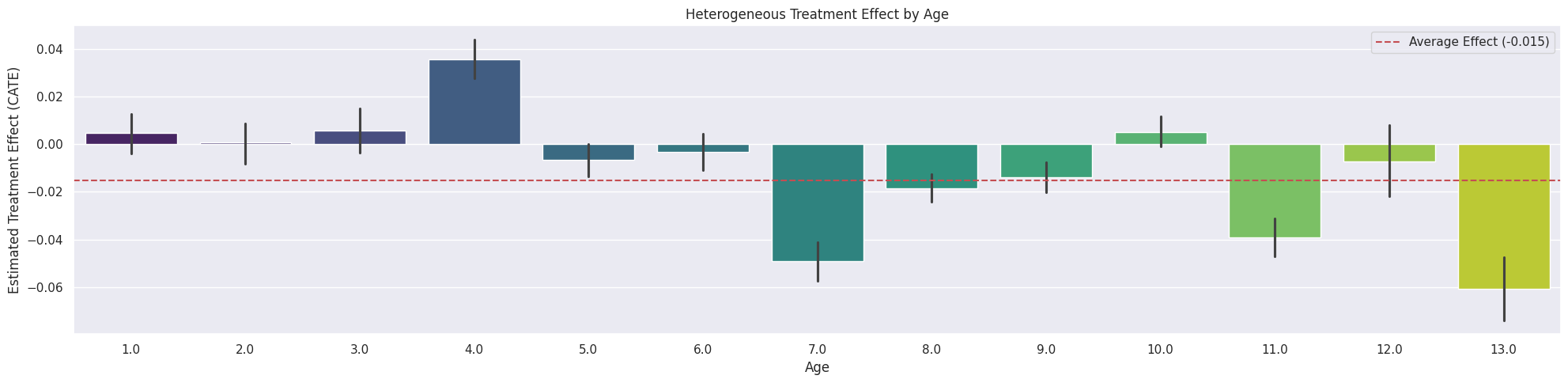
run_placebo_test(X, T, Y, n_simulations=10)
Purpose: Robustness check (Refutation).
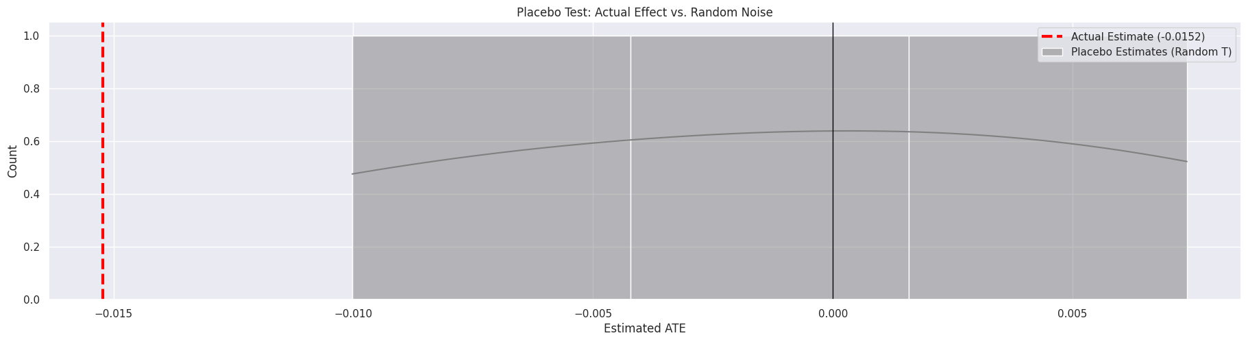
- Logic: Randomly shuffles the treatment array to break any true causal link, then re-trains the model
- Success criteria: The “Placebo ATE” should cluster around 0; the “Actual ATE” should be far outside this distribution
- Interpretation: If the actual effect falls inside the placebo distribution, the result is statistically indistinguishable from noise
# Robustness check: shuffle T to see if the model finds an effect where none
# exists.
navigator.run_placebo_test(X_demo, T_demo, Y_demo, n_simulations=3)
Running Placebo Test (3 permutations)
Generating propensity score
predict_proba not available, using predict instead
Error metrics for group Active
RMSE (Control): 0.2732
RMSE (Treatment): 0.3013
sMAPE (Control): 1.7878
sMAPE (Treatment): 1.8411
Gini (Control): 0.8686
Gini (Treatment): 0.7417
Sim 1/3: Placebo ATE = -0.01002
Generating propensity score
predict_proba not available, using predict instead
Error metrics for group Active
RMSE (Control): 0.2691
RMSE (Treatment): 0.3031
sMAPE (Control): 1.8172
sMAPE (Treatment): 1.8316
Gini (Control): 0.8492
Gini (Treatment): 0.7525
Sim 2/3: Placebo ATE = -0.00045
Generating propensity score
predict_proba not available, using predict instead
Error metrics for group Active
RMSE (Control): 0.2690
RMSE (Treatment): 0.3021
sMAPE (Control): 1.8181
sMAPE (Treatment): 1.8301
Gini (Control): 0.8659
Gini (Treatment): 0.7560
Sim 3/3: Placebo ATE = 0.00738
run_sensitivity_analysis(X, T, Y)
Purpose: Quantifies the stability of the causal estimate.
- Logic: Iteratively removes one covariate at a time and re-calculates the Average Treatment Effect (ATE)
- Output: A horizontal bar chart showing the ATE for each scenario compared to the baseline
- Interpretation:
- Stable - bars cluster near the baseline (red line)
- Sensitive - a bar shifts significantly or crosses zero, indicating that specific variable drives the result
# Sensitivity analysis: check how stable the result is when removing one
# covariate at a time.
navigator.run_sensitivity_analysis(X_demo, T_demo, Y_demo)
Running Sensitivity Analysis (Covariate Removal)
Baseline ATE: -0.01522
... testing robustness without 'HighBP'
Generating propensity score
predict_proba not available, using predict instead
Error metrics for group Active
RMSE (Control): 0.3189
RMSE (Treatment): 0.2862
sMAPE (Control): 1.7075
sMAPE (Treatment): 1.8727
Gini (Control): 0.8155
Gini (Treatment): 0.7379
... testing robustness without 'HighChol'
Generating propensity score
predict_proba not available, using predict instead
Error metrics for group Active
RMSE (Control): 0.3215
RMSE (Treatment): 0.2850
sMAPE (Control): 1.7096
sMAPE (Treatment): 1.8709
Gini (Control): 0.8111
Gini (Treatment): 0.7492
... testing robustness without 'Age'
Generating propensity score
predict_proba not available, using predict instead
Error metrics for group Active
RMSE (Control): 0.3331
RMSE (Treatment): 0.2931
sMAPE (Control): 1.7190
sMAPE (Treatment): 1.8790
Gini (Control): 0.7729
Gini (Treatment): 0.6968
... testing robustness without 'Income'
Generating propensity score
predict_proba not available, using predict instead
Error metrics for group Active
RMSE (Control): 0.3306
RMSE (Treatment): 0.2883
sMAPE (Control): 1.7156
sMAPE (Treatment): 1.8730
Gini (Control): 0.7837
Gini (Treatment): 0.7352
... testing robustness without 'Sex'
Generating propensity score
predict_proba not available, using predict instead
Error metrics for group Active
RMSE (Control): 0.3176
RMSE (Treatment): 0.2835
sMAPE (Control): 1.7050
sMAPE (Treatment): 1.8695
Gini (Control): 0.8235
Gini (Treatment): 0.7522
... testing robustness without 'GenHlth'
Generating propensity score
predict_proba not available, using predict instead
Error metrics for group Active
RMSE (Control): 0.3301
RMSE (Treatment): 0.2921
sMAPE (Control): 1.7179
sMAPE (Treatment): 1.8785
Gini (Control): 0.7869
Gini (Treatment): 0.7074
... testing robustness without 'BMI'
Generating propensity score
predict_proba not available, using predict instead
Error metrics for group Active
RMSE (Control): 0.3477
RMSE (Treatment): 0.2979
sMAPE (Control): 1.7305
sMAPE (Treatment): 1.8821
Gini (Control): 0.7268
Gini (Treatment): 0.6959
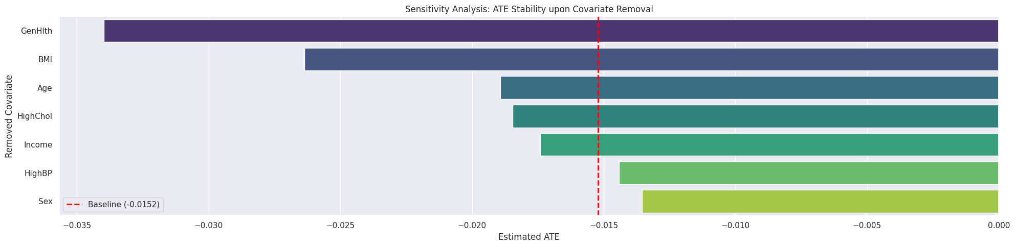
Interpretation: Variables causing large shifts from the red line are critical confounders
compare_estimators(X, T, Y)
Purpose: Advanced model selection (“Horse Race”).
- Methodology: Splits data into Train (70%) and Test (30%); trains S, T, X, R, and DR learners on the training set
- Metric: Generates a Cumulative Gain Chart (Uplift Curve) on the test set
- Why this metric: Since ground-truth CATE is impossible to observe, RMSE cannot be used. The Gain Chart measures how well a model sorts individuals from “High Responder” to “Low Responder”
- Outputs:
- Uplift Curve Plot - visual comparison of model performance
- Qini/AUUC Score Table - numerical ranking of models (Area Under Uplift Curve)
# Estimator comparison ("Horse Race"): compare X-Learner against S, T, R, and
# DR Learners using Uplift Curves.
navigator.compare_estimators(X_demo, T_demo, Y_demo)
Starting Estimator Tournament
Training S-Learner
Training T-Learner
Training X-Learner
Generating propensity score
predict_proba not available, using predict instead
Generating propensity score
Training R-Learner
Generating propensity score
predict_proba not available, using predict instead
generating out-of-fold CV outcome estimates
training the treatment effect model for 1.0 with R-loss
Training DR-Learner
Generating propensity score
predict_proba not available, using predict instead
Generate outcome regressions
Fit pseudo outcomes from the DR formula
Generating propensity score
predict_proba not available, using predict instead
Generate outcome regressions
Fit pseudo outcomes from the DR formula
Generating propensity score
predict_proba not available, using predict instead
Generate outcome regressions
Fit pseudo outcomes from the DR formula
Generating Uplift Curves (Metrics on Test Set)
--- Qini / AUUC Scores (Higher is Better) ---
T-Learner -0.480162
DR-Learner -0.486017
X-Learner -0.500775
R-Learner -0.510762
S-Learner -0.538588
dtype: float64
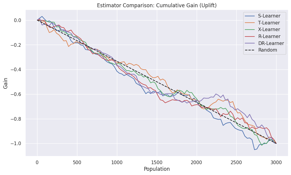
Interpretation: The line that stays highest on the Y-axis sorts patients best