Causal Graphs and Causal Discovery
- This notebook teaches the foundations of causal graphs and causal discovery
- How to encode domain knowledge as a DAG
- How to learn causal structure from data using different algorithm families
- How to validate and refute hypothesized causal graphs
Imports
%load_ext autoreload
%autoreload 2

# System libraries.
import logging

# Third-party libraries.
import matplotlib.pyplot as plt
import pandas as pd
import seaborn as sns
# Helpers imports.
import helpers.hdbg as hdbg
import helpers.hnotebook as hnotebook
import helpers.hgraphviz as hgraphviz
# Notebook-specific utilities.
import dowhy_01_causal_graphs_utils as dauti
_LOG = logging.getLogger(__name__)
# Initialize notebook configuration and logging.
hnotebook.config_notebook()
hdbg.init_logger(verbosity=logging.INFO, use_exec_path=False)
_LOG.info("Notebook initialized")Cell 1: Introduction to causal graphs
- Causal graphs (DAGs) encode assumptions about how variables influence each
other
- A statistical model describes joint distributions
- A causal model describes what happens under interventions
- The classic example: ice cream sales and drownings are correlated because
temperature drives both
- Statistical thinking sees a correlation
- Causal thinking attributes both to a common cause and rejects the direct link
# In the function the process generating the data is a set of equations
# representing the causal DAG.

# dauti.cell1_plot_correlation_vs_causation??
# Plot a correlation-vs-causation example with the implied DAG.
dauti.cell1_plot_correlation_vs_causation()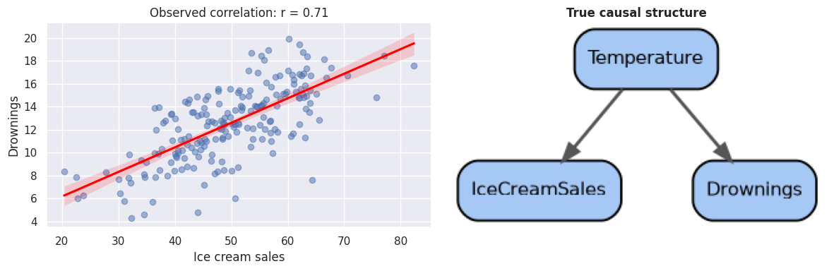
# Build three motivating DAGs across health, economics, and social domains.
domain_dags = dauti.cell1_create_motivating_dags()

# Print and plot the DAGs to show how domain knowledge is encoded as a structure.
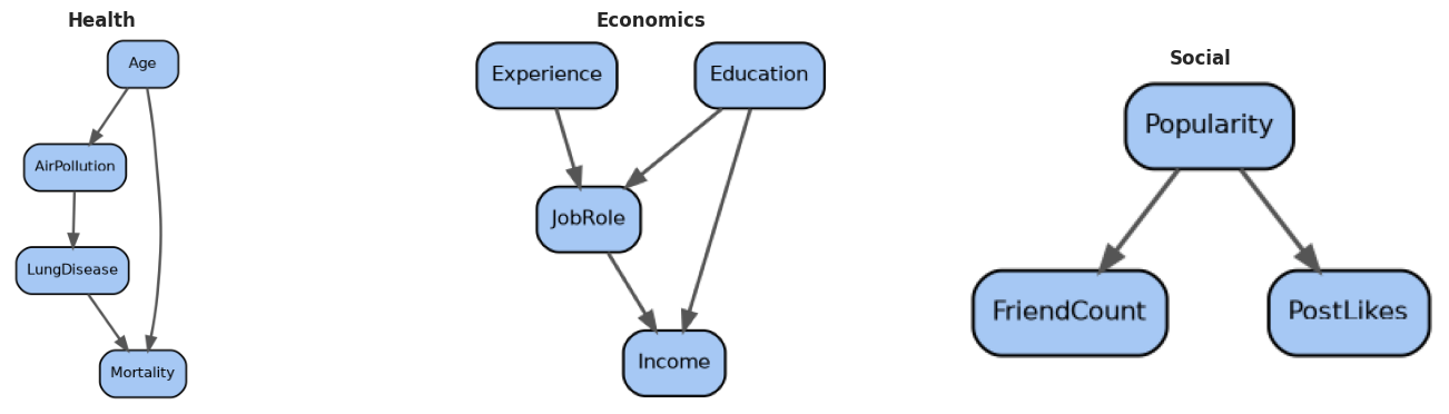
dauti.cell1_print_and_plot_motivating_dags(domain_dags)
# Each domain encodes domain knowledge as a DAG that constrains plausible
# causal mechanisms.
Health domain DAG edges:
AirPollution -> LungDisease
LungDisease -> Mortality
Age -> AirPollution
Age -> Mortality
Economics domain DAG edges:
Education -> JobRole
Education -> Income
JobRole -> Income
Experience -> JobRole
Social domain DAG edges:
Popularity -> FriendCount
Popularity -> PostLikes
# Interactive widget: toggle edges to explore the space of DAGs.
# The widget shows all edges even when the graph is not a DAG, with proper layout margins.
dauti.cell1_interactive_edge_toggle(domain_dags["Health"])
# Toggling edges shows how each assumption changes the implied causal story.
Loading...
Cell 2: Domain knowledge and expert causal graphs
- In practice, experts encode their understanding as a DAG with explicit edges
- We simulate a healthcare dataset with a known DAG so we can later check whether discovery methods recover it
- Variables in the simulated dataset:
- , , ,
- , ,
# Build the expert DAG that captures the true data-generating process.
true_dag = dauti.cell2_build_domain_dag()

fig, ax = plt.subplots(figsize=(10, 7))
hgraphviz.plot_causal_dag(
    true_dag,
    "Expert-specified healthcare DAG",
    mode="graphviz",
    ax=ax,
    figsize=(10, 7),
)
plt.show()
# Print the graph structure as an edge list table for inspection.
dauti.cell2_describe_graph(true_dag)Loading...
# dauti.cell2_generate_healthcare_data??# Generate the synthetic healthcare data.
df_health = dauti.cell2_generate_healthcare_data(n_samples=1000)
print(f"Generated {len(df_health)} samples with {df_health.shape[1]} variables")
df_health.head()Generated 1000 samples with 7 variables
Loading...
Cell 3: Limitations of domain knowledge alone
- Domain experts may disagree about edge directions or which edges exist
- The data can help adjudicate by checking which candidate graph best matches the observed conditional independencies
- We compare three candidate hypotheses on the subset and score each against data
# Build candidate hypothesis graphs and score them against the data.
candidates = dauti.cell3_make_candidate_graphs()
sub_df = pd.DataFrame(
    df_health[["Exercise", "Diet", "Cholesterol", "BloodPressure"]]
)
# Score each candidate graph by testing whether its implied conditional
# independencies hold in the data. The score is the mean p-value at non-edges
# (pairs not directly connected in the DAG). Higher scores indicate the graph
# is more consistent with the data's conditional independence structure.
scores = {
    name: dauti.cell3_score_graph_against_data(G, sub_df)
    for name, G in candidates.items()
}

scores_df = pd.DataFrame(
    [
        {"Hypothesis": name, "Mean p-value at non-edges": score}
        for name, score in scores.items()
    ]
)
display(scores_df)
Loading...
# dauti.cell3_score_graph_against_data??# Interactive widget: pick a hypothesis and inspect its data-consistency score.
dauti.cell3_interactive_hypothesis_comparison(sub_df, candidates)
# Higher scores mean the data is more consistent with the graph's implied
# conditional independencies.Loading...
Cell 4: Causal discovery algorithms overview
- Three main library families dominate practical causal discovery
CDT(Causal Discovery Toolbox): score-based and hybrid methodsdodiscover: PyWhy’s constraint-based discovery frameworkcausal-learn: a broad library covering PC, FCI, GES, LiNGAM
- All approaches share a common workflow: data independence tests skeleton orientation rules causal graph
- They differ in assumptions, computational complexity, and output type
# Show the comparison table of algorithm families.
dauti.cell4_algorithm_comparison_table()
Loading...
Cell 5: Causal discovery with CDT
- CDT focuses on score-based pipelines that learn skeletons then orient edges
- The simplified CDT-style discovery here:
- Builds the skeleton using partial correlation tests at increasing conditioning set sizes
- Orients each edge using a provided topological ordering
- We compare the discovered DAG to the true expert DAG using precision, recall, and F1
# Run a CDT-style discovery on the healthcare data.
variable_order = [
    "Age",
    "AirPollution",
    "Exercise",
    "Diet",
    "Cholesterol",
    "BloodPressure",
    "HeartDisease",
]
cdt_dag = dauti.cell5_run_cdt_like_discovery(
    df_health,
    alpha=0.05,
    variable_order=variable_order,
)
# Compare the discovered DAG to ground truth.
cdt_metrics = dauti.cell5_compute_graph_metrics(true_dag, cdt_dag)
print("CDT-style discovery vs ground truth:")
for k, v in cdt_metrics.items():
print(f" {k}: {v:.3f}" if isinstance(v, float) else f" {k}: {v}")CDT-style discovery vs ground truth:
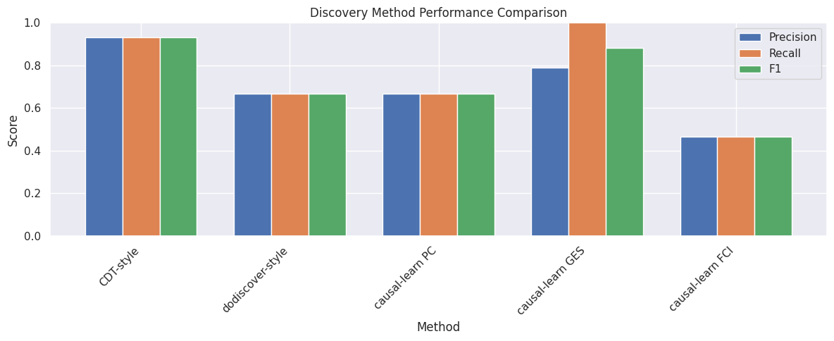
precision: 0.933
recall: 0.933
f1: 0.933
tp: 14
fp: 1
fn: 1
# Visualize the side-by-side comparison.
dauti.cell5_plot_discovery_comparison(true_dag, cdt_dag, figsize=(14, 5))
# Green edges are correctly recovered; red edges are spurious.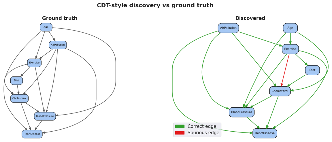
Cell 6: Causal discovery with dodiscover
dodiscoverfollows the constraint-based PC family- The simplified
dodiscover-style discovery here:- Builds the skeleton via conditional independence tests
- Records separating sets for non-adjacent pairs
- Orients v-structures using the rule: if are unshielded and is not in the separating set of and , then
# Run a dodiscover-style PC procedure.
dodiscover_dag = dauti.cell6_run_dodiscover_like(df_health, alpha=0.05)

dodiscover_metrics = dauti.cell5_compute_graph_metrics(true_dag, dodiscover_dag)

print("dodiscover-style discovery vs ground truth:")
for k, v in dodiscover_metrics.items():
    print(f"  {k}: {v:.3f}" if isinstance(v, float) else f"  {k}: {v}")
dodiscover-style discovery vs ground truth:
precision: 0.667
recall: 0.667
f1: 0.667
tp: 10
fp: 5
fn: 5
# Visualize the side-by-side comparison.
dauti.cell5_plot_discovery_comparison(true_dag, dodiscover_dag, figsize=(14, 5))
# Green edges are correctly recovered; red edges are spurious.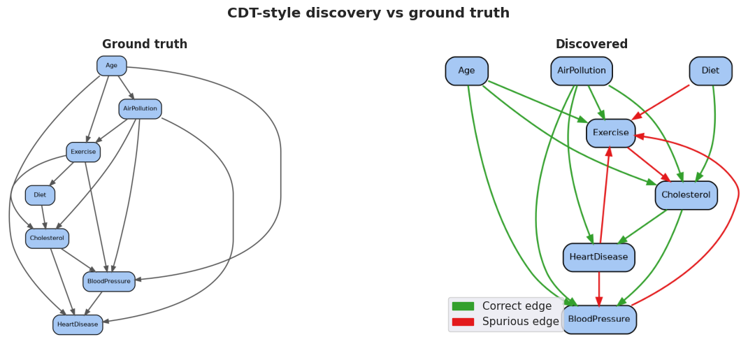
Cell 7: Causal discovery with causal-learn
causal-learnprovides several algorithm flavors:- PC: constraint-based, returns a CPDAG
- GES: greedy equivalence search, score-based
- FCI: handles potential latent confounders, returns a PAG
- We expose all three through a single interactive widget so students can compare the resulting graphs
# Run PC algorithm.
pc_dag = dauti.cell7_run_pc_algorithm(df_health, alpha=0.05)

# Compute metrics.
pc_metrics = dauti.cell5_compute_graph_metrics(true_dag, pc_dag)

dauti._print_method_metrics("causal-learn PC vs ground truth", pc_metrics)
causal-learn PC vs ground truth:
precision: 0.667
recall: 0.667
f1: 0.667
tp: 10
fp: 5
fn: 5
# Visualize the side-by-side comparison.
dauti.cell5_plot_discovery_comparison(true_dag, pc_dag, figsize=(14, 5))
# Green edges are correctly recovered; red edges are spurious.
# Run GES algorithm.
ges_dag = dauti.cell7_run_ges_algorithm(df_health, variable_order=variable_order)
# Compute metrics.
ges_metrics = dauti.cell5_compute_graph_metrics(true_dag, ges_dag)
dauti._print_method_metrics("causal-learn GES vs ground truth", ges_metrics)causal-learn GES vs ground truth:
precision: 0.789
recall: 1.000
f1: 0.882
tp: 15
fp: 4
fn: 0
# Visualize the side-by-side comparison.
dauti.cell5_plot_discovery_comparison(true_dag, ges_dag, figsize=(14, 5))
# Green edges are correctly recovered; red edges are spurious.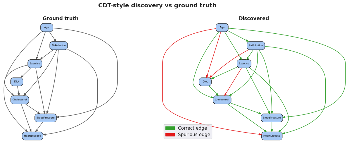
# Run FCI algorithm.
fci_dag = dauti.cell7_run_fci_algorithm(df_health, alpha=0.05)

# Compute metrics.
fci_metrics = dauti.cell5_compute_graph_metrics(true_dag, fci_dag)

dauti._print_method_metrics("causal-learn FCI vs ground truth", fci_metrics)
causal-learn FCI vs ground truth:
precision: 0.467
recall: 0.467
f1: 0.467
tp: 7
fp: 8
fn: 8
# Visualize the side-by-side comparison.
dauti.cell5_plot_discovery_comparison(true_dag, fci_dag, figsize=(14, 5))
# Green edges are correctly recovered; red edges are spurious.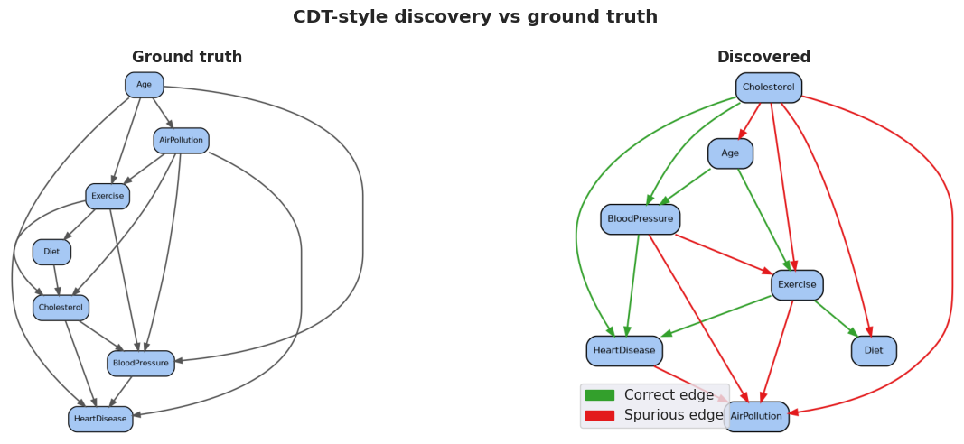
# Interactive widget to switch among causal-learn algorithms.
# Shows discovered graph, ground truth, and metrics side-by-side.
dauti.cell7_interactive_causal_learn_widget(
    df_health,
    true_dag=true_dag,
    variable_order=variable_order,
)
Loading...
Cell 8: Comparing causal discovery methods
- With three discovered graphs, we can ask:
- Which edges did every method find? Those are high-confidence
- Which edges only appear in one method? Those are likely fragile
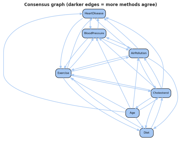
- The consensus graph colors each edge by how many methods agree
# Plot the statistics for all the methods in a single dataframe.
# This shows precision, recall, and F1 for easy comparison.
method_stats = dauti.cell8_plot_method_statistics(
    true_dag,
    {
        "CDT-style": cdt_dag,
        "dodiscover-style": dodiscover_dag,
        "causal-learn PC": pc_dag,
        "causal-learn GES": ges_dag,
        "causal-learn FCI": fci_dag,
    },
)
Loading...
# Aggregate the discovered graphs and build a consensus.
all_methods = {
    "CDT-style": cdt_dag,
    "dodiscover-style": dodiscover_dag,
    "causal-learn PC": pc_dag,
    "causal-learn GES": ges_dag,
    "causal-learn FCI": fci_dag,
}
consensus_graph, edge_support = dauti.cell8_compute_consensus_graph(all_methods)
# Plot the consensus graph with support-weighted edges.
dauti.cell8_plot_consensus_graph(
consensus_graph,
edge_support,
n_methods=len(all_methods),
figsize=(9, 7),
)
# Show a per-edge agreement table sorted by how many methods found each edge.
dauti.cell8_agreement_table(all_methods)
Loading...
Cell 9: Independence tests for causal validation
- Conditional independence is the workhorse of causal validation
- means provides no info about once is known
- Different test types make different assumptions:
- Pearson: linear, Gaussian-friendly
- Spearman: rank-based, monotone relationships
- Kernel CMI: nonparametric (omitted here for runtime)
- Each implied independence is a falsifiable prediction of the graph
# Test a sample of the independencies implied by the true graph.
implied_tests = dauti.cell9_test_graph_implied_independencies(
    true_dag,
    df_health,
    max_pairs=8,
)

print(implied_tests)
X Y Conditioning Statistic P_value Independent_at_0.05
0 Age HeartDisease (none) 0.442216 3.959247e-49 False
1 Age Diet (none) -0.256000 1.989761e-16 False
2 AirPollution Diet Age -0.176871 1.795778e-08 False
3 Exercise Cholesterol Age, AirPollution -0.120414 1.351119e-04 False
4 BloodPressure Diet Age, AirPollution, Exercise, Cholesterol 0.052804 9.513854e-02 True
5 HeartDisease Diet AirPollution, Exercise, Cholesterol, BloodPres... 0.011278 7.216915e-01 True
# Interactive widget: pick variables and a conditioning set.
dauti.cell9_interactive_independence_widget(df_health)
# Try $Cholesterol$ vs $BloodPressure$ given $\{Age, Exercise\}$ to see how
# conditioning changes apparent dependence.
Loading...
Cell 10: Refuting causal graphs with graph refutations
- A refutation test asks: does the data violate the implied independencies?
- For every non-adjacent pair, we test
- If many such tests reject independence, the graph is suspect
- The annotated graph highlights nodes that participate in the most violations
# Run a full refutation analysis on the discovered consensus graph.
refutations = dauti.cell10_refute_graph(
    dodiscover_dag,
    df_health,
    alpha=0.05,
)

n_violations = int(refutations["Violation"].sum())
print(f"Number of refutation violations: {n_violations} of {len(refutations)}")
refutations.head(10)
Number of refutation violations: 4 of 6
Loading...
# Visualize the annotated graph with violation-weighted node colors.
dauti.cell10_plot_annotated_graph(
    dodiscover_dag,
    refutations,
    figsize=(9, 7),
)
# Darker red nodes participate in more violations and warrant scrutiny.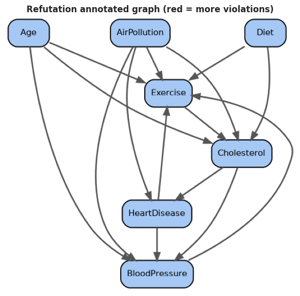
Cell 11: Sensitivity analysis on graph discovery
- Discovered graphs depend on sample size, significance level, and data subsets
- Sensitivity analysis re-runs discovery under different conditions to identify which edges are stable across runs
- Stable edges deserve more confidence; fragile edges should be reported with uncertainty
# Compute edge stability across multiple subsample sizes.
sample_sizes = [100, 200, 300, 500, 750, 1000]
stability = dauti.cell11_sensitivity_over_sample_size(
    df_health,
    sample_sizes,
    alpha=0.05,
    random_state=0,
)

stability.head(15)
Loading...
# Visualize stability scores as a bar plot.
fig, ax = plt.subplots(figsize=(10, 6))
sns.barplot(
    data=stability.head(15),
    x="Stability",
    y="Edge",
    hue="Edge",
    palette="viridis",
    legend=False,
    ax=ax,
)
ax.set_title("Top-15 edges by discovery stability", fontweight="bold")
ax.set_xlim(0, 1)
plt.tight_layout()
plt.show()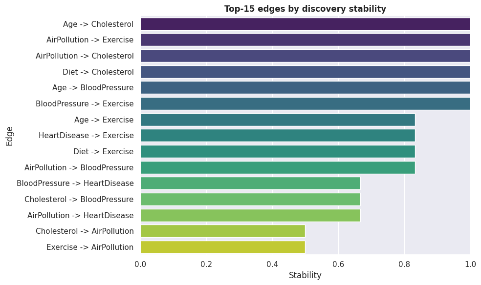
# Interactive widget: explore how discovery changes with sample size and alpha.
dauti.cell11_interactive_sensitivity_widget(df_health)
# Edges that persist across many widget settings are the most robust.
Loading...