Graphical Causal Models and Structural Causal Models
- This notebook teaches graphical causal models (GCMs) and structural causal models (SCMs)
- How to specify causal graphs that encode domain knowledge
- How to assign and customize causal mechanisms
- How to fit models to data and evaluate their quality
- How to use fitted models for counterfactual reasoning
Imports
%load_ext autoreload
%autoreload 2

# System libraries.
import logging

# Third-party libraries.
# Helpers imports.
import helpers.hdbg as hdbg
import helpers.hnotebook as hnotebook
import helpers.hgraphviz as hgraphviz
# Notebook-specific utilities.
import dowhy_02_gcm_utils as utils
try:
from IPython.display import display
except ImportError:
def display(obj):
print(obj)
_LOG = logging.getLogger(__name__)
# Initialize notebook configuration and logging.
hnotebook.config_notebook()
hdbg.init_logger(verbosity=logging.INFO, use_exec_path=False)
_LOG.info("Notebook initialized")WARNING: Running in Jupyter
INFO > cmd='/opt/venv/lib/python3.12/site-packages/ipykernel_launcher.py -f /root/.local/share/jupyter/runtime/kernel-03e1d1b0-e598-43e5-801c-8d2a634a1fe0.json'
INFO Notebook initialized
Cell 1: What are Graphical Causal Models?
- A graphical causal model (GCM) has two components
- A directed acyclic graph (DAG) showing causal structure
- A causal mechanism for each node describing how it depends on parents
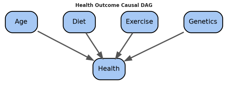
- Example: Health outcome model with age, diet, exercise, genetics
- The DAG encodes causal assumptions
- Mechanisms describe functional relationships (e.g., )
- Distinction between probabilistic and structural causal models
- Probabilistic causal models (PCMs) encode joint distributions
- Structural causal models (SCMs) enable counterfactual reasoning via mechanisms
# Plot the correlation vs causation example.
utils.cell1_plot_correlation_vs_causation()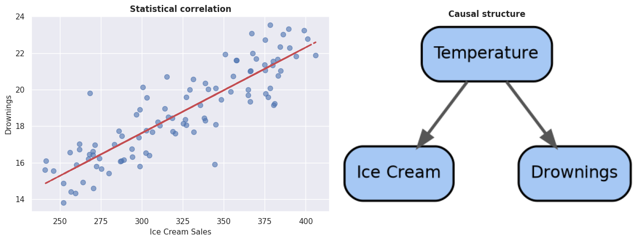
# Create and visualize a health outcome causal DAG.
# The DAG encodes the assumption that health depends on age, diet, exercise, and genetics.
health_dag = utils.cell1_create_health_dag()

_ = hgraphviz.plot_causal_dag(
    health_dag,
    "Health Outcome Causal DAG",
    mode="graphviz",
)
Cell 2: Building a Simple GCM by Hand
- To build a GCM, start with a simple example where we manually specify
- The causal DAG (which variables cause which)
- The mechanisms (functional relationships)
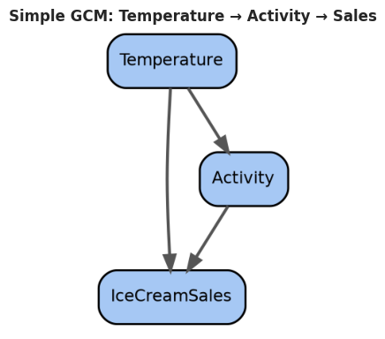
- Example: Temperature drives both activity and ice cream sales
- Mechanism for activity:
- Mechanism for sales:
# Create a simple causal graph with manually defined mechanisms.
gcm, mechanisms = utils.cell2_create_simple_gcm()

_ = hgraphviz.plot_causal_dag(
    gcm,
    "Simple GCM: Temperature → Activity → Sales",
    mode="graphviz",
    figsize=(4, 4),
)
# Generate samples from the model.
df_simple = utils.cell2_generate_samples_from_gcm(gcm, mechanisms, n_samples=200)

display(df_simple.head())
print(f"\nGenerated {len(df_simple)} samples from the GCM")
Loading...
Generated 200 samples from the GCM
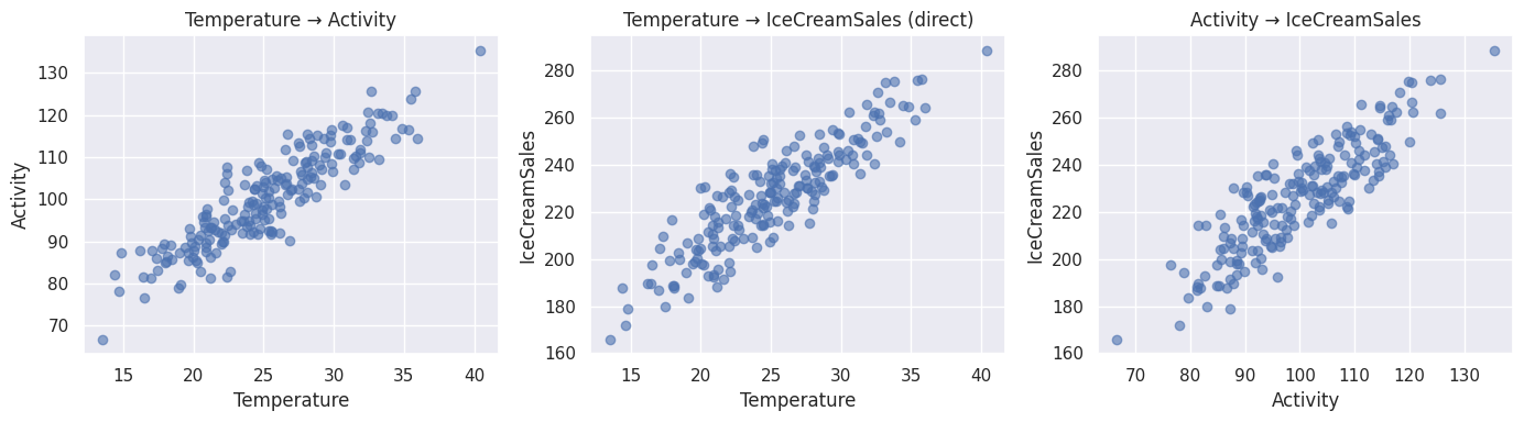
# Visualize relationships between variables.
utils.cell2_plot_relationships(
    df_simple, "Temperature", "Activity", "IceCreamSales"
)
Cell 3: Automatic Mechanism Assignment
- When working with real data, we may not know the exact mechanisms
- DoWhy can automatically assign mechanisms based on the data:
- Fit linear mechanisms by default
- Explore nonlinear mechanisms for complex relationships
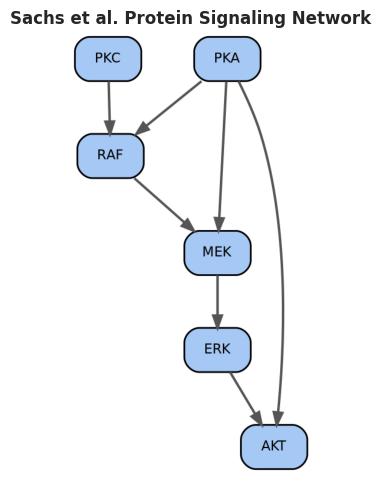
- We load the Sachs et al. protein signaling dataset with a known causal structure
# Load the Sachs et al. dataset with known causal structure.
df_sachs, sachs_dag = utils.cell3_load_sample_dataset("sachs")

display(df_sachs.head())
print(f"\nDataset shape: {df_sachs.shape}")
Loading...
Dataset shape: (200, 6)
# utils.cell3_assign_mechanisms_automatically??# Automatically assign mechanisms to the DAG.
# This function inspects the causal graph and assigns mechanism types based on
# node positions:
# - Root nodes (no parents) get exogenous mechanisms (sample from standard normal)
# - Other nodes get linear mechanisms f(parents) + noise
mechanisms_auto = utils.cell3_assign_mechanisms_automatically(
sachs_dag, df_sachs
)
print("Automatically assigned mechanisms:")
for node, mech in mechanisms_auto.items():
print(f" {node}: {mech['form'] if 'form' in mech else mech['type']}")Automatically assigned mechanisms:
PKC: standard normal
PKA: standard normal
RAF: RAF = f(PKC, PKA) + noise
MEK: MEK = f(PKA, RAF) + noise
ERK: ERK = f(MEK) + noise
AKT: AKT = f(ERK, PKA) + noise
# Visualize the Sachs dataset causal structure.
_ = hgraphviz.plot_causal_dag(
    sachs_dag,
    "Sachs et al. Protein Signaling Network",
    mode="graphviz",
    figsize=(5, 5),
)
Cell 4: Fitting an SCM to Data
- Once mechanisms are assigned, fit the model to data
- Sequential fitting: estimate parameters for each node independently
- For each node, regress it on its parents
- Record residuals and R² as quality metrics
- This approach is fast and interpretable for linear models
# utils.cell4_fit_scm_simple??# Fit a simple linear SCM to the Sachs data.
fitted_params = utils.cell4_fit_scm_simple(sachs_dag, df_sachs)
# The fitted_params dictionary contains:
# - For exogenous nodes (no parents): mean and std of the variable
# - For endogenous nodes (with parents): intercept and slope coefficients from
# linear regression, plus R² and residual_std to assess fit quality
# import pprint
# pprint.pprint(fitted_params)
print("# Fitted model parameters:")
for node, params in fitted_params.items():
if "r_squared" in params:
print(
f" {node}: R² = {params['r_squared']:.3f}, Residual Std = {params['residual_std']:.3f}"
)
else:
print(
f" {node}: Mean = {params['mean']:.3f}, Std = {params['std']:.3f}"
)# Fitted model parameters:
PKC: Mean = -0.041, Std = 0.931
PKA: Mean = 0.086, Std = 0.987
RAF: R² = 0.396, Residual Std = 0.491
MEK: R² = 0.517, Residual Std = 0.501
ERK: R² = 0.557, Residual Std = 0.476
AKT: R² = 0.408, Residual Std = 0.513
Cell 5: Generating Samples from a Fitted Model
- Once fitted, use the model to generate synthetic samples
- Forward sample through the DAG
- Sample exogenous variables (sources)
- For each node, apply mechanism using parent values plus noise
- Compare synthetic samples with original data to validate the fit
- Good agreement between synthetic and original distributions suggests the model captured the underlying data-generating process
- Discrepancies indicate the model misses important patterns
- This validation step is crucial before using the model for prediction or counterfactual reasoning
# utils.cell5_generate_synthetic_samples??# Generate synthetic samples from the fitted model.
df_synthetic = utils.cell5_generate_synthetic_samples(
sachs_dag, fitted_params, n_samples=200
)
display(df_synthetic.head())
print(f"\nGenerated {len(df_synthetic)} synthetic samples")Loading...
Generated 200 synthetic samples
# Compare original vs synthetic distributions.
utils.cell5_compare_distributions(df_sachs, df_synthetic, figsize=(16, 4))

# Good alignment suggests the model captured the data distribution well.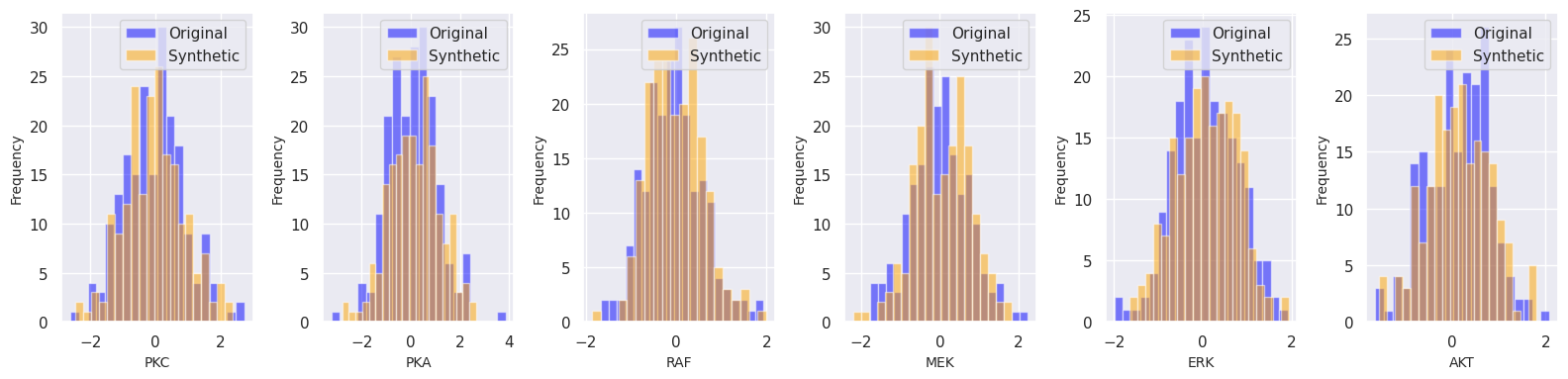
The plots above show histograms comparing the distributions of the original and synthetic data for each variable
- The overlapping histograms (blue for original, orange for synthetic) indicate how well the fitted model reproduces the data distribution
- Close alignment across all variables suggests the model successfully captured the joint distribution; significant divergence suggests the model needs refinement (e.g., nonlinear mechanisms, more data, or parameter tuning).
Cell 6: Evaluating Model Quality
- Assess whether the fitted model captures the data well
- For each mechanism:
- Compute R² (proportion of variance explained)
- Inspect residuals for independence and normality
- Identify variables with poor fit
- Problematic mechanisms warrant customization or more data
# utils.cell6_evaluate_model_quality??# Evaluate the quality of each fitted mechanism.
evaluation = utils.cell6_evaluate_model_quality(
sachs_dag, fitted_params, df_sachs
)
display(evaluation)Loading...
- R² values indicate how much variance each mechanism explains
- Higher R² → better fit. Values < 0.5 may warrant attention
Cell 7: Confidence Intervals for Causal Estimates
- Parameter estimates from finite data have uncertainty
- Use bootstrap to estimate confidence intervals
- Resample data with replacement
- Recompute causal quantities
- Report percentile-based intervals
- Wider intervals indicate more uncertainty in the causal effect
# Estimate confidence intervals for a causal quantity via bootstrap.
treatment_var = "PKA"
outcome_var = "ERK"

point_est, ci = utils.cell7_bootstrap_confidence_intervals(
    sachs_dag, df_sachs, treatment_var, outcome_var, n_bootstrap=100
)

print(f"Effect of {treatment_var} on {outcome_var}:")
print(f"  Point estimate: {point_est:.3f}")
print(f"  95% CI: [{ci[0]:.3f}, {ci[1]:.3f}]")
print(
    "\nInterpretation: With 95% confidence, the causal effect lies in the interval."
)
Effect of PKA on ERK:
Point estimate: 0.110
95% CI: [-0.053, 0.292]
Interpretation: With 95% confidence, the causal effect lies in the interval.
Cell 8: Customizing Causal Mechanism Assignment
- Automatic mechanism assignment assumes linearity
- Use custom mechanisms when domain knowledge suggests nonlinear relationships
- Exponential growth in resource usage
- Saturation effects (sigmoid curves)
- Piecewise or threshold-based behaviors
- Mix automatic and custom mechanisms in the same model
# Create a GCM with custom nonlinear mechanisms.
custom_gcm, custom_mechanisms = utils.cell8_custom_mechanism_example()

df_custom = utils.cell2_generate_samples_from_gcm(
    custom_gcm, custom_mechanisms, n_samples=300
)

# Visualize custom nonlinear relationships.
utils.cell2_plot_relationships(df_custom, "Input", "Output1", "Output2")

# Custom mechanisms capture nonlinear relationships that linear models miss.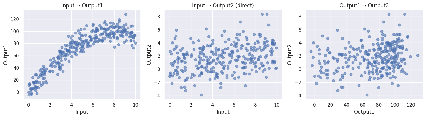
Cell 9: Root Cause Analysis Example
- Scenario: API latency increases; which system metric should we optimize?
- Build a causal model from infrastructure knowledge
- CPU usage drives memory and network latency
- Network latency impacts API latency
- Fit model to normal operations data
- Use counterfactual reasoning to identify highest-impact interventions
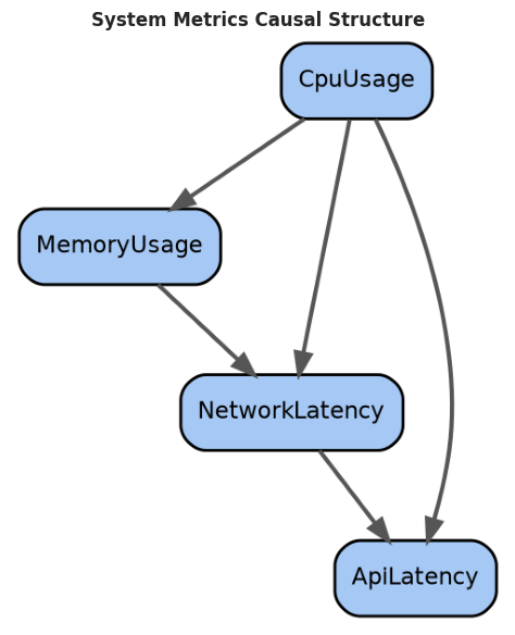
# In this example, we assume we know the causal structure of system behavior:
# - CPU usage is a root cause (no parents, driven by external workload)
# - Memory and network latency increase when CPU is high
# - API latency depends on both network latency and memory pressure
# This known causal graph allows us to identify which metrics to optimize
# to reduce API latency via counterfactual reasoning.
# utils.cell9_system_metrics_dataset??# Load system metrics dataset with known causal structure.
df_metrics, metrics_dag = utils.cell9_system_metrics_dataset(n_samples=300)
# Visualize the system metrics causal structure.
_ = hgraphviz.plot_causal_dag(
metrics_dag,
"System Metrics Causal Structure",
mode="graphviz",
)
display(df_metrics.head())
print(f"\nDataset: {df_metrics.shape[0]} observations of system behavior")Loading...
Dataset: 300 observations of system behavior
# utils.cell4_fit_scm_simple??# Fit the system model.
metrics_params = utils.cell4_fit_scm_simple(metrics_dag, df_metrics)
print("System causal model fit quality:")
for node, params in metrics_params.items():
if "r_squared" in params:
print(f" {node}: R² = {params['r_squared']:.3f}")System causal model fit quality:
MemoryUsage: R² = 0.639
NetworkLatency: R² = 0.864
ApiLatency: R² = 0.857
# Counterfactual analysis: "What if we reduced CPU usage by 20%?"
# We answer this by modifying the data and refitting the model to estimate
# cascading effects through the causal graph. The fitted parameters from the
# causal model let us predict how reducing CPU would impact memory and network
# latency, and ultimately API latency. This identifies the most impactful
# optimization target.

# Estimate impact of reducing each metric on API latency.
baseline_latency = df_metrics["ApiLatency"].mean()

# Counterfactual: reduce CPU usage by 20%
df_reduced_cpu = df_metrics.copy()
df_reduced_cpu["CpuUsage"] *= 0.8

# Estimate cascading effects
reduced_cpu_metrics = utils.cell4_fit_scm_simple(metrics_dag, df_reduced_cpu)
counterfactual_latency_cpu = df_reduced_cpu["ApiLatency"].mean()

improvement = baseline_latency - counterfactual_latency_cpu
percent_improvement = 100 * improvement / baseline_latency

print(f"Baseline API latency: {baseline_latency:.2f} ms")
print(f"Counterfactual (reduce CPU 20%): {counterfactual_latency_cpu:.2f} ms")
print(f"Improvement: {improvement:.2f} ms ({percent_improvement:.1f}%)")
Baseline API latency: 80.75 ms
Counterfactual (reduce CPU 20%): 80.75 ms
Improvement: 0.00 ms (0.0%)
Cell 10: Medical Counterfactual Example
- Scenario: Personalized treatment recommendations
- Build a causal model of patient outcomes
- Age and cholesterol confound treatment assignment
- Treatment effect heterogeneity by patient characteristics
- Fit model to historical data
- Use counterfactuals to recommend treatment for new patients
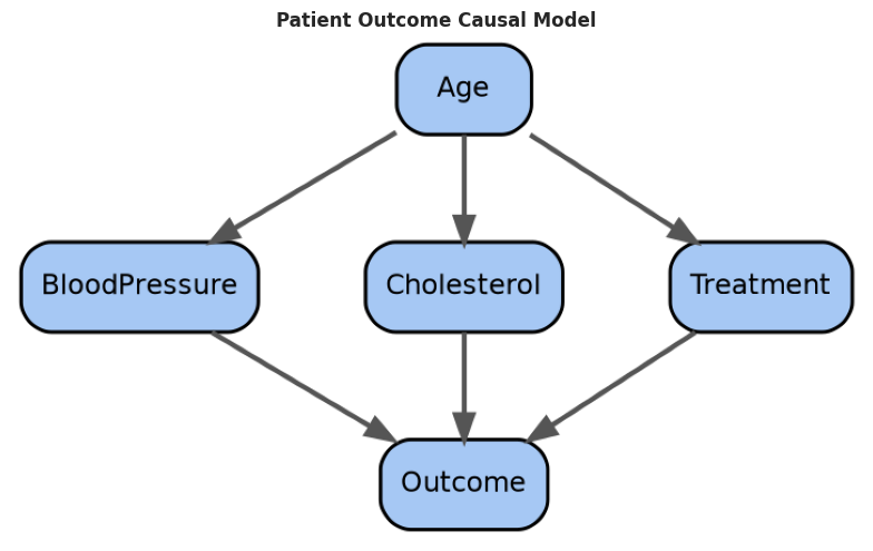
# In this example, we assume a known causal structure for patient outcomes:
# - Age and genetics are root causes
# - Age affects blood pressure, cholesterol, and treatment decisions
# - Treatment is assigned based on baseline health metrics (confounding)
# - Outcome depends on age, cholesterol, blood pressure, and treatment
# With this known structure, we can estimate heterogeneous treatment effects
# for individual patients by reasoning about causal mechanisms.
# Load medical records dataset.
df_medical, medical_dag = utils.cell10_medical_dataset(n_samples=400)
# Visualize the medical causal structure.
_ = hgraphviz.plot_causal_dag(
medical_dag,
"Patient Outcome Causal Model",
mode="graphviz",
)
display(df_medical.head())
print(f"\nMedical records: {df_medical.shape[0]} patients")Loading...
Medical records: 400 patients
# Fit the healthcare causal model.
medical_params = utils.cell4_fit_scm_simple(medical_dag, df_medical)

print("Healthcare model fit:")
for node, params in medical_params.items():
    if "r_squared" in params:
        print(f"  {node}: R² = {params['r_squared']:.3f}")
Healthcare model fit:
BloodPressure: R² = 0.154
Cholesterol: R² = 0.100
Treatment: R² = 0.322
Outcome: R² = 0.574
# Personalized treatment recommendation via counterfactual reasoning:
# For a given patient profile, we estimate the treatment effect by finding
# similar patients (matched on age, baseline health) and comparing their
# outcomes with and without treatment. The causal structure ensures we're
# comparing similar enough patients that the treatment assignment differences
# are plausibly causal rather than due to confounding.

# Estimate treatment effect for a specific patient.
patient_profile = {
    "Age": 65,
    "BloodPressure": 140,
    "Cholesterol": 220,
}

# Extract relevant rows matching patient profile (approximately)
similar_patients = df_medical[
    (df_medical["Age"] >= patient_profile["Age"] - 5)
    & (df_medical["Age"] <= patient_profile["Age"] + 5)
]

outcome_with_treatment = similar_patients[similar_patients["Treatment"] == 1][
    "Outcome"
].mean()
outcome_without_treatment = similar_patients[similar_patients["Treatment"] == 0][
    "Outcome"
].mean()

treatment_effect = outcome_with_treatment - outcome_without_treatment

print(
    f"Patient: Age {patient_profile['Age']}, Cholesterol {patient_profile['Cholesterol']}"
)
print("\nEstimated outcomes:")
print(f"  With treatment: {outcome_with_treatment:.2f}")
print(f"  Without treatment: {outcome_without_treatment:.2f}")
print(f"  Treatment effect: {treatment_effect:.2f}")
print(
    f"\nRecommendation: {'Recommend treatment' if treatment_effect > 0 else 'Recommend no treatment'}"
)
Patient: Age 65, Cholesterol 220
Estimated outcomes:
With treatment: 105.14
Without treatment: 84.76
Treatment effect: 20.38
Recommendation: Recommend treatment
Cell 11: Model Limitations and When GCMs Fail
- GCMs rely on key assumptions that can be violated
- Causal Markov condition: Variables conditionally independent given parents
- Causal sufficiency: No hidden confounders (all causes measured)
- Acyclicity: No feedback loops
- Mechanism autonomy: Mechanisms don’t change when other nodes intervene
- Consequences of violations:
- Unobserved confounders → spurious correlations misattributed as causal
- Feedback loops → DAG assumption breaks down
- Nonlinear mechanisms fit with linear model → poor predictions