Imports
%load_ext autoreload
%autoreload 2

import logging

import matplotlib.pyplot as plt
import numpy as np
import pandas as pd
import seaborn as sns
from IPython.display import display

# Set plotting style.
sns.set_style("whitegrid")
plt.rcParams["figure.figsize"] = (12, 6)
The autoreload extension is already loaded. To reload it, use:
%reload_ext autoreload
import helpers.hmatplotlib as hmatplo
import helpers.hpandas_display as hpandisp

import helpers.htutorial as ut
import L08_04_01_causal_inference_utils as mtl0cireout

ut.config_notebook()

# Initialize logger.
logging.basicConfig(level=logging.INFO)
_LOG = logging.getLogger(__name__)

dir_name = "L08_data"
!ls $dir_name

out_dir_name = "figures/"
markdown_path_prefix = "msml610/lectures_source"
WARNING:msml610_utils:vim support installed: restart the notebook, if needed
INFO:msml610_utils:Setting notebook style
INFO:msml610_utils:Notebook signature
INFO:msml610_utils:numpy version=1.26.4
INFO:msml610_utils:pymc version=5.18.2
INFO:msml610_utils:matplotlib version=3.10.3
INFO:msml610_utils:arviz version=0.21.0
INFO:msml610_utils:preliz version=0.19.0
Python 3.12.3
Linux df0445a574d1 6.12.67-linuxkit #1 SMP Sun Jan 25 02:26:28 UTC 2026 aarch64 aarch64 aarch64 GNU/Linux
Part 1: Sales Example
Cell 1.1: Loading the sales data
Goal:
- Analyze real-world sales data to illustrate the challenge of causal inference: observational data can be misleading due to confounding
Implementation: mtl0cireout.load_xmas_sales_data(dir_name)
data = mtl0cireout.load_xmas_sales_data(dir_name)
print("data.shape=", data.shape)
display(data.head(6))
Module 'dataframe_image' is already installed.
xmas_sales_df_png = f"{out_dir_name}/L08.4.xmas_sales_df.png"
hpandisp.convert_df_to_png(
    data.head(6),
    xmas_sales_df_png,
    index=True,
    print_markdown=True,
    markdown_path_prefix=markdown_path_prefix,
)
Cell 1.2: Visualizing sales by treatment status
Goal:
- Compare sales outcomes between stores with and without price cuts
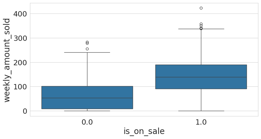
Implementation: mtl0cireout.plot_xmas_sales_boxplot(data)
- Box plots of weekly sales for treated (cut prices) and control (no price cut) groups: visual evidence suggests price cuts increase sales, but this may reflect confounding rather than a true causal effect
fig = mtl0cireout.plot_xmas_sales_boxplot(data)
xmas_boxplot_png = f"{out_dir_name}/L08.4.xmas_boxplot.png"
hmatplo.save_fig(
    fig, xmas_boxplot_png, print_markdown=True, path_prefix=markdown_path_prefix
)
Cell 1.3: Conceptual example: potential outcomes
Goal:
- Illustrate the fundamental problem of causal inference using
potential outcomes: each unit
ihas 2 potential outcomes,y0(under control) andy1(under treatment), but only one is ever observed
# i = unit identifier
# y0, y1 = potential outcomes under control and treatment (idealized situation)
# t = treatment indicator
# x = group
# df1 = pd.DataFrame(
#     dict(
#         i=[1, 2, 3, 4, 5, 6],
#         y0=[200, 120, 300, 450, 600, 600],
#         y1=[220, 140, 400, 500, 600, 800],
#         t=[0, 0, 0, 1, 1, 1],
#         x=[0, 0, 1, 0, 0, 1],
#     )
# )
# df1
(2000, 5)
Loading...
# # Select the outcome based on the treatment.
# df1["y"] = (df1["t"] * df1["y1"] + (1 - df1["t"]) * df1["y0"]).astype(int)
#
# # Treatment effect.
# df1["te"] = df1["y1"] - df1["y0"]
#
# df1
PNG image saved to: 'figures/L08.4.xmas_sales_df.png'

# df2 = pd.DataFrame(
#     dict(
#         i=[1, 2, 3, 4, 5, 6],
#         y0=[200, 120, 300, np.nan, np.nan, np.nan],
#         y1=[np.nan, np.nan, np.nan, 500, 600, 800],
#         t=[0, 0, 0, 1, 1, 1],
#         x=[0, 0, 1, 0, 0, 1],
#     )
# )
# df2
# # Select the outcome based on the treatment.
# df2["y"] = (df2["t"] * df2["y1"] + (1 - df2["t"]) * df2["y0"]).astype(int)
#
# # Treatment effect.
# df2["te"] = df2["y1"] - df2["y0"]
#
# df2Cell 1.4: Visualizing bias from pooling treated/control stores
Goal:
- Visualize scatter points and regression lines for treated and control stores
Implementation: mtl0cireout.plot_sales_bias_analysis(data)
- Treated stores (red) and control stores (blue), each with its own regression trend: within each group, the relationship between baseline sales and treatment appears similar, but the overall pooled relationship is different
fig = mtl0cireout.plot_sales_bias_analysis(data)
bias_analysis0_png = f"{out_dir_name}/L08.4.Association_Causation_Bias0.png"
hmatplo.save_fig(
    fig,
    bias_analysis0_png,
    print_markdown=True,
    path_prefix=markdown_path_prefix,
)
INFO:matplotlib.category:Using categorical units to plot a list of strings that are all parsable as floats or dates. If these strings should be plotted as numbers, cast to the appropriate data type before plotting.
INFO:matplotlib.category:Using categorical units to plot a list of strings that are all parsable as floats or dates. If these strings should be plotted as numbers, cast to the appropriate data type before plotting.
Saved figure to 'figures/L08.4.xmas_boxplot.png'

Cell 1.5: Comparing pooled vs stratified trends
Goal:
- Compare pooled vs stratified regression models on synthetic data
Implementation: mtl0cireout.plot_single_vs_separate_trends()
- Left panel: single trend line across all data. Right panel: separate trend lines for large and small businesses. Simpson’s paradox emerges when aggregation obscures group-level trends, and stratification reveals the true relationships
fig = mtl0cireout.plot_single_vs_separate_trends()
bias_analysis1_png = f"{out_dir_name}/L08.4.Association_Causation_Bias1.png"
hmatplo.save_fig(
    fig,
    bias_analysis1_png,
    print_markdown=True,
    path_prefix=markdown_path_prefix,
)
Cell 1.6: Simpson’s paradox
Goal:
- Illustrate Simpson’s paradox, where the aggregate and group-level trends contradict each other
Implementation: mtl0cireout.plot_simpsons_paradox()
- 2 groups (blue and red), each with a positive within-group trend, but a negative overall trend: ignoring a confounding variable (like business size) leads to contradictory causal conclusions
fig = mtl0cireout.plot_simpsons_paradox()
simpsons_paradox_png = f"{out_dir_name}/L08.4.Simpson_Paradox.png"
hmatplo.save_fig(
    fig,
    simpsons_paradox_png,
    print_markdown=True,
    path_prefix=markdown_path_prefix,
)
Cell 1.7: University Simpson’s paradox
Goal:
- Demonstrate Simpson’s paradox in a university-admissions context with 2 different groups
Implementation: mtl0cireout.plot_university_simpsons_paradox()
- Left panel: groups A and B each with a positive admission trend. Right panel: the aggregated data shows a reversed, negative overall trend. Ignoring group differences (e.g., selectivity, baseline rates) leads to reversed causal conclusions in aggregate data
fig = mtl0cireout.plot_university_simpsons_paradox()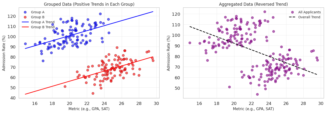
Part 2: A/B Testing
Cell 2.1: Loading the email A/B test data
Goal:
- Apply causal inference concepts to A/B testing with email marketing data, to measure treatment effects and quantify their uncertainty
data = pd.read_csv(f"{dir_name}/cross_sell_email.csv")
print("data.shape=", data.shape)
display(data.head(3))
(323, 4)
Loading...
Cell 2.2: Checking covariate balance across groups
Goal:
- Check that the treatment groups are balanced on observed covariates, a precondition for a clean treatment-effect comparison
display(data.groupby(["cross_sell_email"]).mean())Loading...
# Evaluate balance co-variate.
covariates = ["gender", "age"]
mu = data.groupby("cross_sell_email")[covariates].mean()
var = data.groupby("cross_sell_email")[covariates].var()
norm_diff = (mu - mu.loc["no_email"]) / np.sqrt((var + var.loc["no_email"]) / 2)
display(norm_diff)
Loading...
Cell 2.3: Regression to the mean in school scores
Goal:
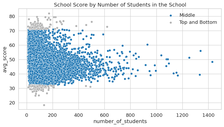
- Illustrate regression to the mean using school-score data, showing how selection effects can mislead causal conclusions
Implementation: mtl0cireout.plot_top_school_size_boxplot(df),
mtl0cireout.plot_score_by_school_size_scatter(df)
- Top-scoring schools skew smaller: a school’s small size (and hence noisier average score) can push it into the “top 1%” by chance, which is why the top and bottom of the score distribution both have disproportionately small schools
df = pd.read_csv(f"{dir_name}/enem_scores.csv")
print("df.shape=", df.shape)
display(df.head(3))
(37941, 4)
Loading...
display(df.sort_values(by="avg_score", ascending=False).head(5))Loading...
fig = mtl0cireout.plot_top_school_size_boxplot(df)
top_school_size_png = f"{out_dir_name}/L08.4.top_school_size.png"
hmatplo.save_fig(
    fig,
    top_school_size_png,
    print_markdown=True,
    path_prefix=markdown_path_prefix,
)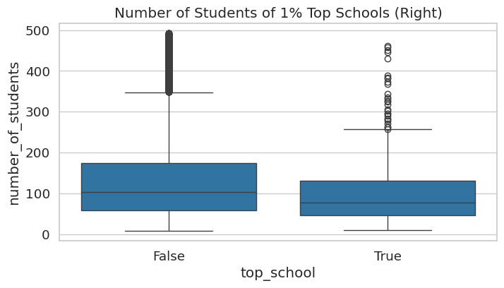
fig = mtl0cireout.plot_score_by_school_size_scatter(df)
score_by_school_size_png = (
    f"{out_dir_name}/L08.4.School_score_by_number_students.png"
)
hmatplo.save_fig(
    fig,
    score_by_school_size_png,
    print_markdown=True,
    path_prefix=markdown_path_prefix,
)
Saved figure to 'figures/L08.4.School_score_by_number_students.png'

Cell 2.4: Standard error of the estimate
Goal:
- Compute the standard error of the mean (SEM) for each email group, which measures the precision of the sample mean as an estimate of the population mean
data = pd.read_csv(f"{dir_name}/cross_sell_email.csv")

short_email = data.query("cross_sell_email=='short'")["conversion"]
long_email = data.query("cross_sell_email=='long'")["conversion"]
email = data.query("cross_sell_email!='no_email'")["conversion"]
no_email = data.query("cross_sell_email=='no_email'")["conversion"]

display(data.groupby("cross_sell_email").size())
cross_sell_email
long 109
no_email 94
short 120
dtype: int64# This is equivalent to long_email.sem().
def se(y: pd.Series) -> float:
return y.std() / np.sqrt(len(y))
print("SE for long email:", se(long_email))
print("SE for short email:", se(short_email))SE for Long Email: 0.021946024609185506
SE for Short Email: 0.030316953129541618
Cell 2.5: Confidence intervals
- In the frequentist view, the data is generated by a process, which
is governed by true (unknown) parameters
- Assume the conversion rate is a Bernoulli distribution with an unknown parameter
- You can run 10,000 experiments, each with 100 customers
- You collect the data and you get a mean close to the “true” mean
- The std dev of the mean is a measure of the uncertainty
- Even if the Bernoulli can only be 0 or 1, the average of the data is asymptotically normally distributed
n = 100
conv_rate = 0.08


def run_experiment() -> np.ndarray:
    return np.random.binomial(1, conv_rate, size=n)


np.random.seed(42)

experiments = [run_experiment().mean() for _ in range(10000)]

plt.figure(figsize=(10, 4))
freq, bins, img = plt.hist(
    experiments, bins=20, label="Experiment means", color="0.6"
)
plt.vlines(
    conv_rate,
    ymin=0,
    ymax=freq.max(),
    linestyles="dashed",
    label="True mean",
    color="0.3",
)
plt.legend()- With the SEM you can create an interval that contains the true mean in 95% of the experiments
- In real life you often have a single experiment, but you can still construct a confidence interval
# Using 1.96 std dev to capture 95% of the density.
exp_se = short_email.sem()
exp_mu = short_email.mean()
ci = (exp_mu - 1.96 * exp_se, exp_mu + 1.96 * exp_se)
print("95% CI for short email:", ci)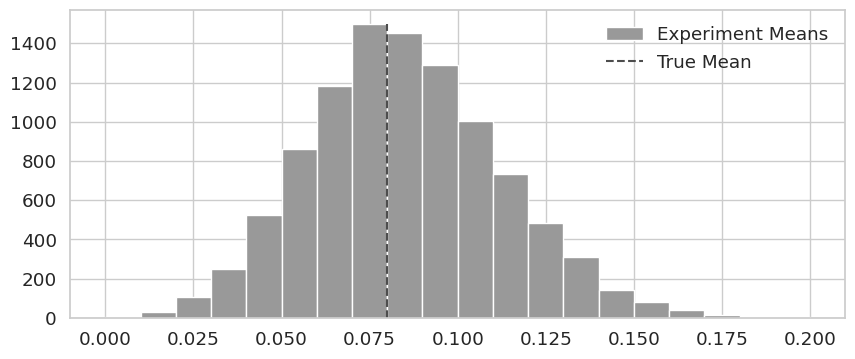
from scipy import stats

conf = 0.95
z = np.abs(stats.norm.ppf((1 - conf) / 2))
print("z=", z)
ci = (exp_mu - z * exp_se, exp_mu + z * exp_se)
print("ci=", ci)
def ci(y: pd.Series) -> tuple:
return (y.mean() - 2 * y.sem(), y.mean() + 2 * y.sem())
print("95% CI for short email:", ci(short_email))
print("95% CI for long email:", ci(long_email))
print("95% CI for no email:", ci(no_email))plt.figure(figsize=(10, 4))
linestyle = ["-", "--", ":", "-."]
x = np.linspace(-0.05, 0.25, 100)
short_dist = stats.norm.pdf(x, short_email.mean(), short_email.sem())
plt.plot(x, short_dist, lw=2, label="Short", linestyle=linestyle[0])
plt.fill_between(
x.clip(ci(short_email)[0], ci(short_email)[1]),
0,
short_dist,
alpha=0.2,
color="0.0",
)
long_dist = stats.norm.pdf(x, long_email.mean(), long_email.sem())
plt.plot(x, long_dist, lw=2, label="Long", linestyle=linestyle[1])
plt.fill_between(
x.clip(ci(long_email)[0], ci(long_email)[1]),
0,
long_dist,
alpha=0.2,
color="0.4",
)
no_email_dist = stats.norm.pdf(x, no_email.mean(), no_email.sem())
plt.plot(x, no_email_dist, lw=2, label="No email", linestyle=linestyle[2])
plt.fill_between(
x.clip(ci(no_email)[0], ci(no_email)[1]),
0,
no_email_dist,
alpha=0.2,
color="0.8",
)
plt.xlabel("Conversion")
plt.legend()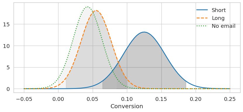
Cell 2.6: Hypothesis testing
- Assume that is that
diff_mu = short_email.mean() - no_email.mean()
diff_se = np.sqrt(no_email.sem() ** 2 + short_email.sem() ** 2)

ci = (diff_mu - 1.96 * diff_se, diff_mu + 1.96 * diff_se)
print(f"95% CI for the difference (short email - no email):\n{ci}")
95% CI for the differece (short email - no email):
(0.01023980847439844, 0.15465380854687816)
- 0 is not included in the CI interval, so can be rejected at 95% confidence
- Test if the “lift” between sending a short email and no email is more than 1%
# Shifting the CI.
diff_mu_shifted = short_email.mean() - no_email.mean() - 0.01
diff_se = np.sqrt(no_email.sem() ** 2 + short_email.sem() ** 2)

ci = (diff_mu_shifted - 1.96 * diff_se, diff_mu_shifted + 1.96 * diff_se)
print(f"95% CI for 1% difference (short email - no email):\n{ci}")
Cell 2.7: Test statistic
- A higher value typically means rejecting
- E.g.,
t_stat = (diff_mu - 0) / diff_se
print("t_stat=", t_stat)
95% CI 1% difference between (short email - no email):
(0.00023980847439844521, 0.14465380854687815)
Cell 2.8: P-value
- Measure how likely it is to see an extreme value under , i.e.,
print("p-value:", (1 - stats.norm.cdf(t_stat)) * 2)p-value: 0.025224235562152142
Cell 2.9: Power
- When designing an experiment, decide the sample size needed to reject
- Power = probability of correctly rejecting when it is false
- Higher power requires larger samples; smaller effect sizes require even larger samples