Plotting and visualization
Table of Contents
import datetime

import pandas as pd

# import pandas_datareader.data as web
print(pd.__version__)
import numpy as np

import matplotlib.pyplot as plt
0.25.0
Plotting and visualization
A brief matplotlib API primer
data = np.arange(10)

data
array([0, 1, 2, 3, 4, 5, 6, 7, 8, 9])plt.plot(data)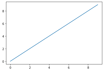
Figures and subplots
# Plots in matplotlib reside within a Figure object.

fig = plt.figure()
print(fig)

# To plot on a blank figure you need to create subplots.
# E.g., create 4 subplots, arranged in a 2x2 grid, selecting the
# first one.
ax1 = fig.add_subplot(2, 2, 1)
ax2 = fig.add_subplot(2, 2, 2)
ax3 = fig.add_subplot(2, 2, 3)

# Notes that plots are reset after each cell is evaluated so
# you might need to put more plotting commands in a single cell.

# Plot a random walk on last subplot, which is pointed by plt.
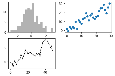
plt.plot(np.random.randn(50).cumsum(), "k--")
# ax3.plot(np.random.randn(50).cumsum(), 'k--')

# Plot an histogram on the first subplot.
ax1.hist(np.random.randn(100), bins=20, color="k", alpha=0.3)

# Plot scatterplot on second subplot.
ax2.scatter(np.arange(30), np.arange(30) + 3 * np.random.randn(30))
Figure(432x288)
# Create a figure with a 2x3 grid of subplots.
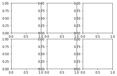
fig, axes = plt.subplots(2, 3)

print(axes)

# With sharex/y one can have the same axes.
[[<matplotlib.axes._subplots.AxesSubplot object at 0x112ad9b00>
<matplotlib.axes._subplots.AxesSubplot object at 0x112b04780>
<matplotlib.axes._subplots.AxesSubplot object at 0x112b8dd30>]
[<matplotlib.axes._subplots.AxesSubplot object at 0x112bcb208>
<matplotlib.axes._subplots.AxesSubplot object at 0x112bfc7b8>
<matplotlib.axes._subplots.AxesSubplot object at 0x112c2ed68>]]
def _plot():
    # Create a figure with a grid of subplots (sharing axes).
    fig, axes = plt.subplots(2, 2, sharex=True, sharey=True)
    for i in range(2):
        for j in range(2):
            axes[i, j].hist(np.random.randn(500), bins=50, color="k", alpha=0.5)


_plot()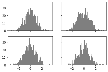
# Control the spacing around the plots.
_plot()
plt.subplots_adjust(wspace=0, hspace=0)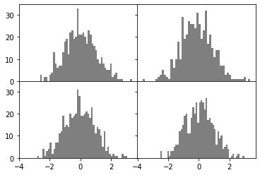
Colors, markers, linestyles
fig, ax = plt.subplots()

# Random points.
x = np.random.randn(10)
y = np.random.randn(10)
ax.plot(x, y, "g--")

# This is a shortcut for:
#   ax.plot(x, y, linestyle='--', color='g')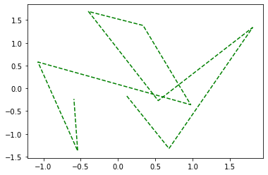
# One can specify color, markers, and linestyle.

data = np.random.randn(30).cumsum()
plt.plot(data, "ko--")
# plt.plot( ... , color='k', linestyle='dashed', market='o')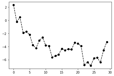
# To plot without interpolation.
plt.plot(data, drawstyle="steps-post")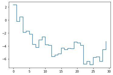
Ticks, labels, legends
One can
- use procedural pyplot interface
- use OO interface
pyplot have methods like xlim, xticks, xticklabels acting on the last axes
- plt.xlim()
- plt.xlim([0, 10])
This corresponds to methods on the object
- ax.get_xlim()
- ax.set_xlim()
def _plot():
    np.random.seed(1000)
    # Create figure.
    fig = plt.figure()
    # Create a subplot.
    ax = fig.add_subplot(1, 1, 1)
    # Plot random walk.
    ax.plot(np.random.randn(1000).cumsum())
    return ax
_plot()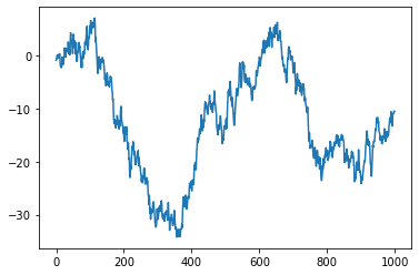
ax = _plot()

# Specify which x-ticks to use.
# _ = ax.set_xticks([0, 250, 500, 750, 1000])
_ = ax.set_xticks(range(0, 1000, 50))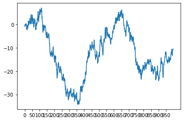
ax = _plot()

# Specify x-ticks and its labels.
_ = ax.set_xticks([0, 250, 500, 750, 1000])
_ = ax.set_xticklabels(
    "one two three four five".split(), rotation=30, fontsize="small"
)
# Give a name to the x-axis.
ax.set_xlabel("Stages")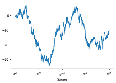
# Create a figure and a single plot.
fig = plt.figure(figsize=(16, 7))
ax = fig.add_subplot(1, 1, 1)

# Plot multiple random walks, with different style / color / marker.
ax.plot(np.random.randn(500).cumsum(), "k", label="one")
ax.plot(np.random.randn(500).cumsum(), "r--", label="two")
ax.plot(np.random.randn(500).cumsum(), "b.", label="three")

ax.legend(loc="best")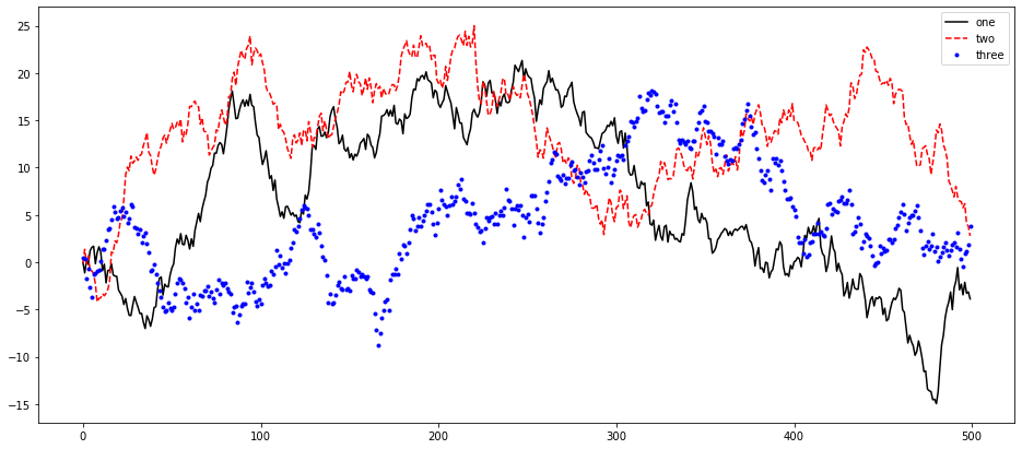
Annotations, drawing
data = pd.read_csv(
    "~/src/pydata-book/examples/spx.csv", index_col=0, parse_dates=True
)

# Plot curve.
fig = plt.figure(figsize=(16, 7))
ax = fig.add_subplot(1, 1, 1)

spx = data["SPX"]
spx.plot(ax=ax, style="k-")

# Plot arrows.
crisis_data = [
    (datetime.datetime(2007, 10, 11), "Peak of bull market"),
    (datetime.datetime(2008, 3, 12), "Bear Stearns Fails"),
    (datetime.datetime(2008, 9, 15), "Lehman Bankrupcty"),
]

for date, label in crisis_data:
    ax.annotate(
        label,
        xy=(date, spx.asof(date) + 75),
        xytext=(date, spx.asof(date) + 225),
        arrowprops=dict(facecolor="black", headwidth=4, width=2, headlength=4),
        horizontalalignment="left",
        verticalalignment="top",
    )

# Zoom in 2007-2008.
ax.set_xlim(["2007-01-01", "2011-01-01"])
ax.set_ylim([600, 1800])
(600, 1800)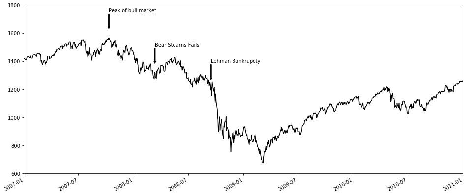
Saving plots to file
# Save the active figure.
# - trim whitespace around actual figure
if False:
    plt.savefig("", dpi=400, bbox_inches="tight")
matplotlib config
# One can modify the config from Python.
if False:
    plt.rc("figure", figsize=(10, 10))

# First arg is:
# - figure
# - axes
# - xtick
# - ytick
# - grid
# - legend
# ...

if False:
    font_options = {"family": "monospace", "weight": "bold", "size": "small"}
    plt.rc("font", **font_options)
Plotting with pandas and seaborn
In matplotlib you assemble a plot from its base components (fairly low level)
- type of plot
- legend
- title
- tick labels ...
pandas allows to plot from DataFrames and Series
seaborn simplifies many common visualization plots
Series
np.random.seed(1000)

s = pd.Series(np.random.randn(10).cumsum(), index=np.arange(0, 100, 10))
print(s)

# Plot using continuous series.
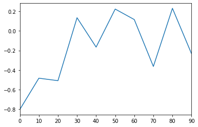
s.plot()
0 -0.804458
10 -0.483527
20 -0.509010
30 0.135314
40 -0.165482
50 0.223992
60 0.116555
70 -0.363428
80 0.231607
90 -0.233060
dtype: float64
# Options for pd.Series.plot():
# - label: label for plot legend
# - style: "ko--"
# - alpha
# - kind: area, bar, barh, density, hist, kde
# - rot: rotate labels
# - xticks: values to use for x-axis
# - xlim, ylim
# - grid
# Plot the data as a barplot using 45* rotated labels.
s.plot(kind="bar", rot=45)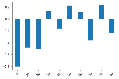
s.plot(kind="hist")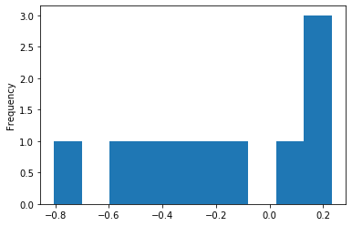
# Estimate density.
s.plot(kind="density", grid=True)
# s.plot(kind="kde")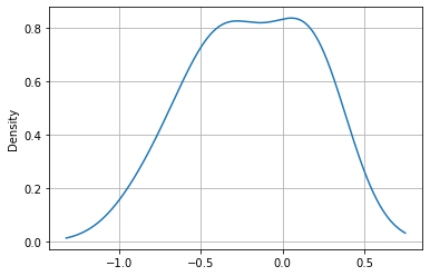
# 1) Most pandas plotting method accept an "ax" param, which can be a matplotlib subplot
# object.
# - This allows to place figures in a grid layout.
# 2) There is a subplot=True argument to plot series in different plots.

# Additional kwargs (keyword arguments) are passed to the underlying matplotlib functions.
Data frame
- Options
- subplots: plot each column in a separate subplot
np.random.seed(1000)

# Create 4 random walks.
df = pd.DataFrame(
    np.random.randn(10, 4).cumsum(axis=0),
    columns=["A", "B", "C", "D"],
    index=np.arange(0, 100, 10),
)

display(df)
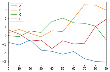
df.plot()
# df.plot.line()
Loading...
# Plot each figure on a different subplot.
df.plot(figsize=(16, 10), subplots=True)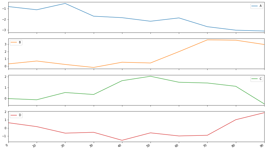
Bar plots
np.random.seed(100)

fig, axes = plt.subplots(2, 1)
data = pd.Series(np.random.rand(16), index=list("abcdefghijklmnop"))
display(data)

# Plot in different subplots using the ax argument.
data.plot.bar(ax=axes[0], color="r", alpha=0.7)
data.plot.barh(ax=axes[1], color="b", alpha=0.7)
a 0.543405
b 0.278369
c 0.424518
d 0.844776
e 0.004719
f 0.121569
g 0.670749
h 0.825853
i 0.136707
j 0.575093
k 0.891322
l 0.209202
m 0.185328
n 0.108377
o 0.219697
p 0.978624
dtype: float64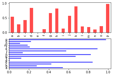
# Plotting a DataFrame as a barplot means plotting multiple bars for each row.
df = pd.DataFrame(
    np.random.rand(6, 4),
    index=["one", "two", "three", "four", "five", "six"],
    columns=pd.Index(["A", "B", "C", "D"], name="Genus"),
)

df
Loading...
# Plot df using different groups.
df.plot(kind="bar")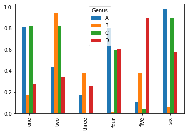
df.plot.barh(stacked=True, alpha=0.5)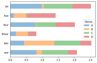
tips = pd.read_csv("~/src/pydata-book/examples/tips.csv")

tips.head()
Loading...
# Cross-tabulate by day and party size.
party_counts = pd.crosstab(tips["day"], tips["size"])

display(party_counts)
Loading...
print(party_counts.sum(axis=1))day
Fri 19
Sat 87
Sun 76
Thur 62
dtype: int64
print(party_counts.sum(axis=1).sum())
print(len(tips))
244
244
# Divide the table by the columns.
party_pcts = party_counts.div(party_counts.sum(1), axis=0)

party_pcts
Loading...
party_pcts.plot.bar()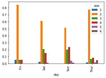
tips[["tip", "total_bill"]].head()Loading...
tips["tip_pct"] = tips["tip"] / (tips["total_bill"] - tips["tip"])

tips[["tip", "total_bill", "tip_pct"]].head()
Loading...
import seaborn as sns

# seaborn
# plotting functions take a data argument as a pd.DataFrame

# 95% conf intervals are reported.
sns.barplot(x="tip_pct", y="day", data=tips, orient="h")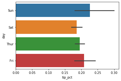
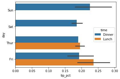
# One can plot data using categorical variable.tips.head()Loading...
sns.barplot(
    x="tip_pct",
    y="day",
    # Use time to group data.
    hue="time",
    #
    data=tips,
    orient="h",
)
# One can change the aesthetics of plots.
sns.set(style="whitegrid")
sns.set()
tips["tip_pct"].plot.hist(bins=50)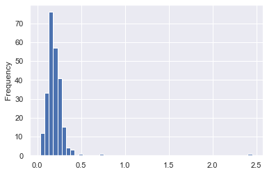
# Approximate the discrete histogram with sum of kernels.
tips["tip_pct"].plot.density()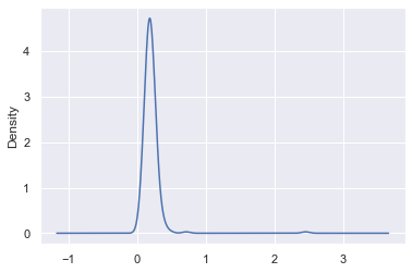
comp1 = np.random.normal(0, 1, size=200)
comp2 = np.random.normal(10, 2, size=200)
values = pd.Series(np.concatenate([comp1, comp2]))
sns.distplot(values, bins=100, color="k")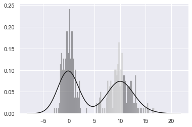
Scatter plots
macro = pd.read_csv("~/src/pydata-book/examples/macrodata.csv")

macro.head()
Loading...
data = macro["cpi m1 tbilrate unemp".split()]

trans_data = np.log(data).diff().dropna()
trans_data[-5:]
Loading...
sns.regplot("m1", "unemp", data=trans_data)
plt.title("Changes in log %s vs log %s" % ("m1", "unemp"))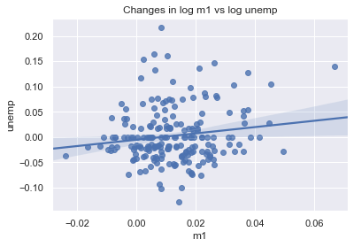
# It is useful to look at the scatter plots among a group of variables:
# - pairs plot
# - scatter plot matrix

# We use plot_kws (keywords) to pass down options.
sns.pairplot(trans_data, diag_kind="kde", plot_kws={"alpha": 0.5})
<seaborn.axisgrid.PairGrid at 0x116714f98>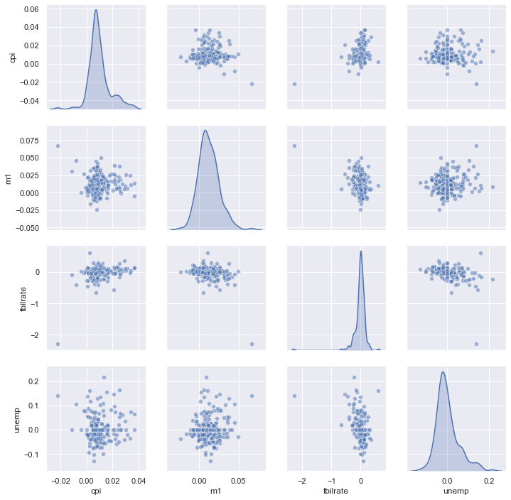
Facet grids.
- We can visualize plots by grouping by different values of a categorical variable
# Use "hue" and "col" to control the graph.
sns.factorplot(
    x="day", y="tip_pct", hue="time", col="smoker", kind="bar", data=tips
)
/Users/saggese/.conda/envs/study/lib/python3.7/site-packages/seaborn/categorical.py:3666: UserWarning: The `factorplot` function has been renamed to `catplot`. The original name will be removed in a future release. Please update your code. Note that the default `kind` in `factorplot` (`'point'`) has changed `'strip'` in `catplot`.
warnings.warn(msg)
<seaborn.axisgrid.FacetGrid at 0x116e50550>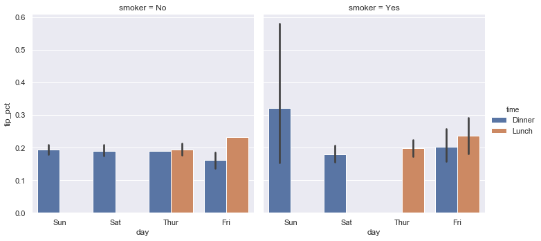
# Use "row" and "col" to control the graph.
sns.factorplot(
    x="day", y="tip_pct", row="time", col="smoker", kind="bar", data=tips
)
<seaborn.axisgrid.FacetGrid at 0x11704b588>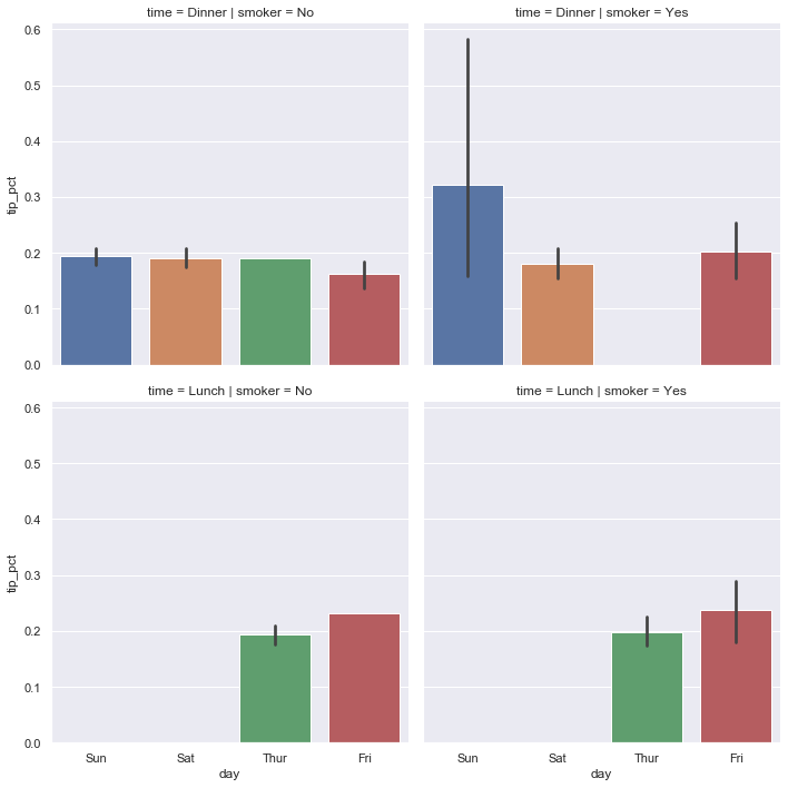
# One can also use different types of plots, e.g., box plots,
# instead of bar plots.

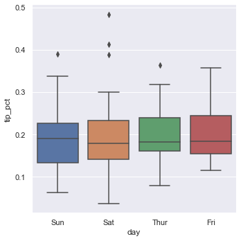
sns.factorplot(x="day", y="tip_pct", kind="box", data=tips[tips.tip_pct < 0.5])
<seaborn.axisgrid.FacetGrid at 0x116eefb38>